 Welcome to Read: 14a
Read: 14a - CSS Transforms, Transitions, and Animations”
In this Read: 14a, I will talk only about:
- CSS Transforms, Transitions, and Animations.
Transforms
With CSS3 came new ways to position and alter elements. Now general layout techniques can be revisited with alternative ways to size, position, and change elements. All of these new techniques are made possible by the transform property.
- Transform Syntax
- The actual syntax for the transform property is quite simple, including the transform property followed by the value. The value specifies the transform type followed by a specific amount inside parentheses.
  div {
  -webkit-transform: scale(1.5);
  -moz-transform: scale(1.5);
  -o-transform: scale(1.5);
      transform: scale(1.5);
  }
- The actual syntax for the transform property is quite simple, including the transform property followed by the value. The value specifies the transform type followed by a specific amount inside parentheses.
- 2D Transforms
- 2D Rotate
``` .box-1 { transform: rotate(20deg); } .box-2 { transform: rotate(-55deg); }
```
- 2D Rotate
-
2D Scale
.box-1 { transform: scale(.75); } .box-2 { transform: scale(1.25); } -
2D Translate
.box-1 { transform: translateX(-10px); } .box-2 { transform: translateY(25%); } .box-3 { transform: translate(-10px, 25%); } -
2D Skew
``` .box-1 { transform: skewX(5deg); } .box-2 { transform: skewY(-20deg); } .box-3 { transform: skew(5deg, -20deg); } ``` 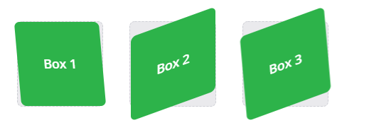<br><br>
For more information please see the reference [1].
Transitions
One evolution with CSS3 was the ability to write behaviors for transitions and animations. Front end developers have been asking for the ability to design these interactions within HTML and CSS, without the use of JavaScript or Flash, for years. Now their wish has come true.
With CSS3 transitions you have the potential to alter the appearance and behavior of an element whenever a state change occurs, such as when it is hovered over, focused on, active, or targeted.
- Transitional Properties
- It is important to note, not all properties may be transitioned, only properties that have an identifiable halfway point. Colors, font sizes, and the alike may be transitioned from one value to another as they have recognizable values in-between one another.
A handful of the more popular transitional properties include the following:
- It is important to note, not all properties may be transitioned, only properties that have an identifiable halfway point. Colors, font sizes, and the alike may be transitioned from one value to another as they have recognizable values in-between one another.
-
Transition Duration
.box { background: #2db34a; border-radius: 6px; transition-property: background, border-radius; transition-duration: .2s, 1s; transition-timing-function: linear; } .box:hover { background: #ff7b29; border-radius: 50%; } -
Transition Timing
.box { background: #2db34a; border-radius: 6px; transition-property: background, border-radius; transition-duration: .2s, 1s; transition-timing-function: linear, ease-in; } .box:hover { background: #ff7b29; border-radius: 50%; } - Transition Delay
  .box {
  background: #2db34a;
  border-radius: 6px
  transition-property: background, border-radius;
  transition-duration: .2s, 1s;
  transition-timing-function: linear, ease-in;
  transition-delay: 0s, 1s;
  }
  .box:hover {
  background: #ff7b29;
  border-radius: 50%;
  }
For more information please see the reference [2].
8 SIMPLE CSS3 TRANSITIONS
Just a couple of lines of code will give you an awesome transition effect that will excite your users, increase engagement and ultimately, when used well, increase your conversions. What’s more, these effects are hardware accelerated, and a progressive enhancement that you can use right now.
Here are 8 really simple effects that will add life to your UI and smiles to your users’ faces.
-
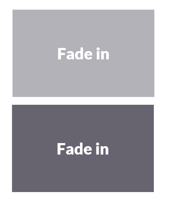
Fade in
  .fade
  {
          opacity:0.5;
  }
  .fade:hover
  {
          opacity:1;
  }
-
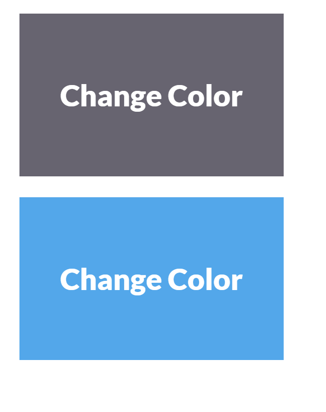
Change color
  .color:hover
  {
          background:#53a7ea;
  }
-
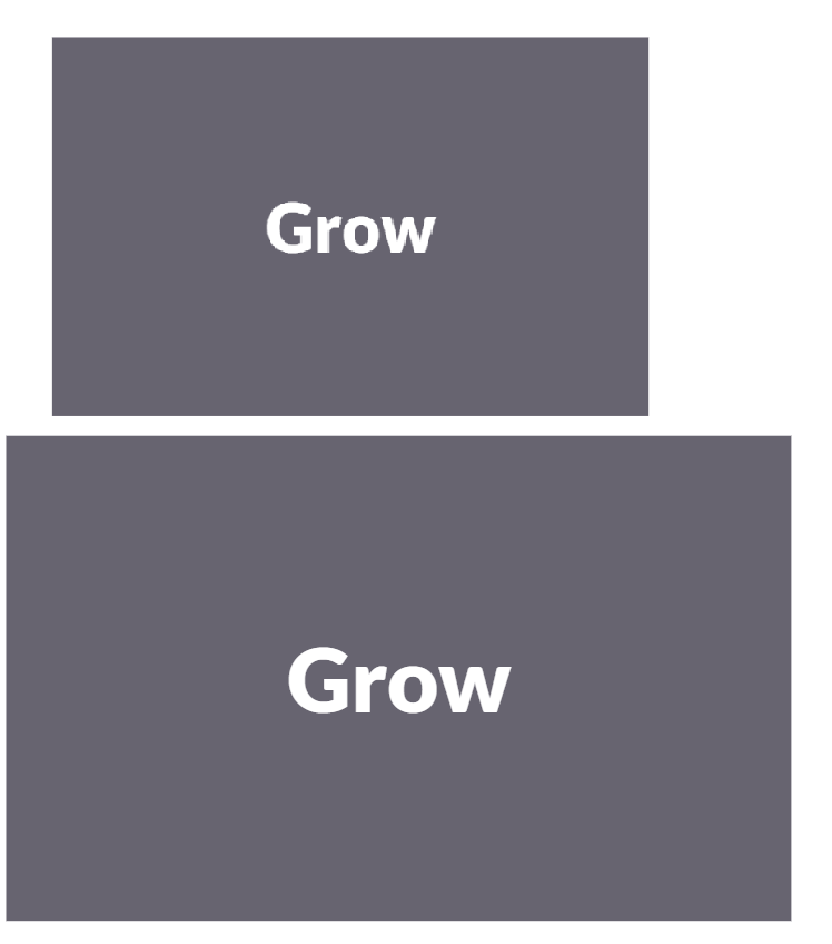
Grow
  .grow:hover
  {
          -webkit-transform: scale(1.3);
          -ms-transform: scale(1.3);
          transform: scale(1.3);
  }
-
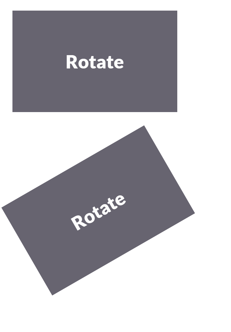
Rotate elements
  .rotate:hover
  {
          -webkit-transform: rotateZ(-30deg);
          -ms-transform: rotateZ(-30deg);
          transform: rotateZ(-30deg);
  }
-
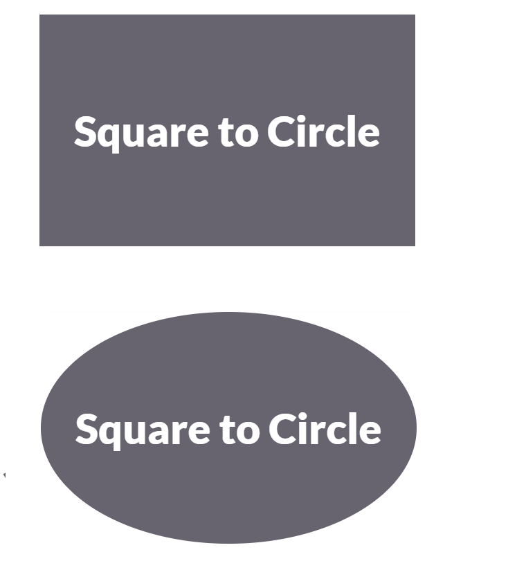
Square to circle
  .circle:hover
  {
          border-radius:50%;
  }
-
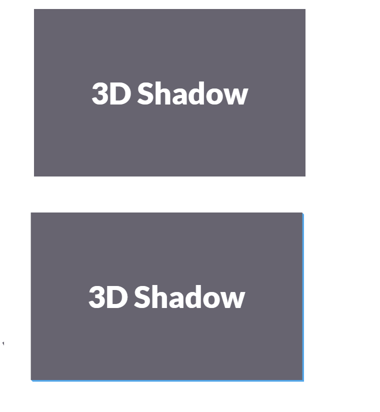
3D shadow
  .threed:hover
  {
          box-shadow:
                  1px 1px #53a7ea,
                  2px 2px #53a7ea,
                  3px 3px #53a7ea;
          -webkit-transform: translateX(-3px);
          transform: translateX(-3px);
  }
-
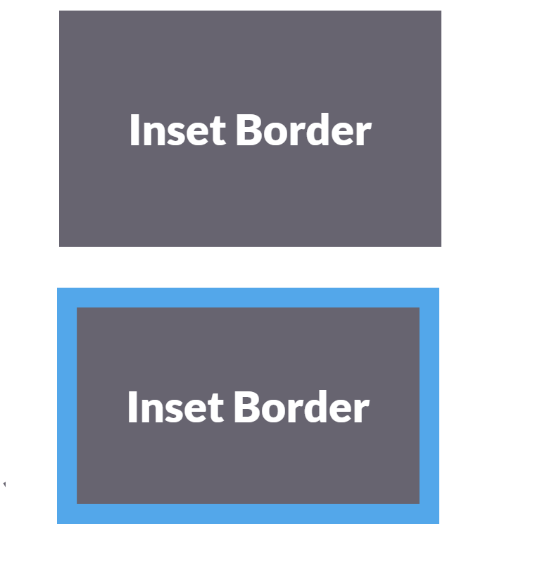
Inset border
  .border:hover
  {
          box-shadow: inset 0 0 0 25px #53a7ea;
  }
For more information please see the reference [3].
Review the following examples on CSS animations of today Read:

